Streamlined Strength: Packaging with Purpose
Our packaging embodies a unified and impactful vision, seamlessly blending design and function to clearly differentiate our brand while meeting our diverse customer needs. Every element crafted with precision and purpose, exuding a straightforward, rugged design that delivers on our packaging priorities of self-contained, vendible, eco-friendly, and retail-optimized.
Packaging Objectives
Move to smaller packaging that is vend-friendly and eco-conscious

Sustainable materials whenever possible

Maximize design and add easy retail features within decided space to allow for easy pivots

Enclose product to eliminate repackaging needs and additional costs for Amazon
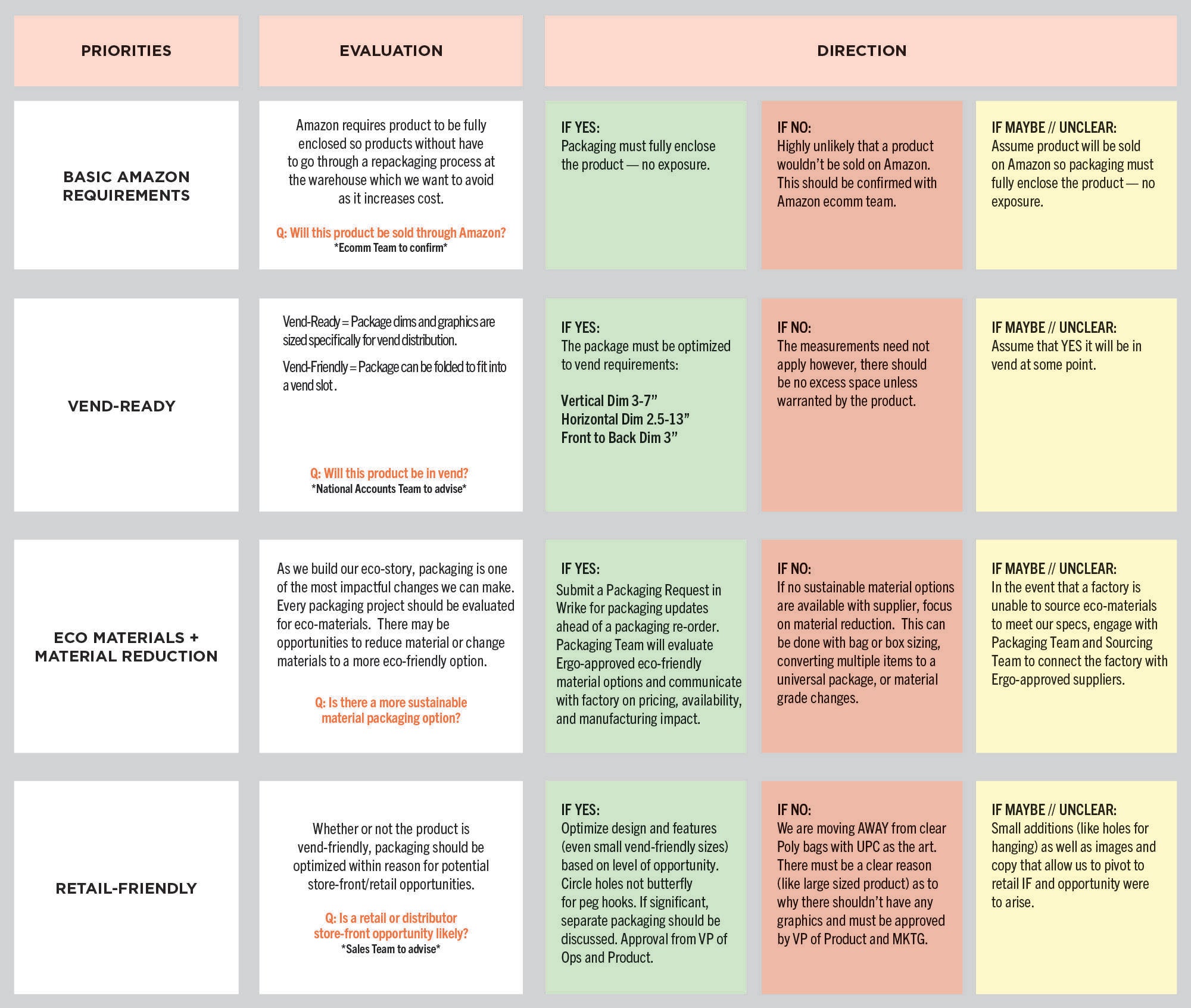
Packaging Design Matrix
This matrix should be referenced to guide the decision-making process of packaging material and design selection and directiThe aim is to streamline the activity and unify our packaging visual experience.
- Measurements must fall within these dimensions:
- Height between 3-7”
- Length (width) must be between 2-10”
- Depth must be between 0.5-3”
- Goal should be to be on the larger side of vend-friendly measurements for design to be optimized 3. Steps should be taken to prevent package from flopping while standing - insert of cardboard or other
- Preferred height is 7” or smaller. Anything over 7.5” may need to be laid horizontal.
- To take up the least amount of space, length/width-wise, we suggest the product be 3” or under. We will not vend anything over 13” long/width.
- The depth of the product needs to be 3” or under to fit between the coils.
- Items smaller than 7/8” x 1-3/4” x 3/8” may need repackaging to vend properly such as envelope.
- Items should be 2-1/2” tall to vend with no repackaging.
- There should be no variance between products and should be consistent packaging to ensure that vending the product doesn’t change from package to package.
- Items containing foam, rubber, or gripping surfaces should be packaged with those surfaces covered to prevent any misvends.
- Sharp products should be in enclosed packaging to prevent any injuries.
- Cutting tools and tools like drill bits should be shrink wrapped with cardboard backing that is full length of the product.
While the details are still being finalized, early designs and concepts for our complete packaging overhaul have been approved. In the meantime, we should be exploring and implementing improved materials wherever possible to enhance our packaging. Read more about our Blue Marble mission here and stay tuned for updates as we get closer to launching our full overhaul.
A dieline is an art file that will include accurate dimensions, cut lines, folds, creases, heat seals, vent holes, etc. Think of this as a blueprint for what the designer needs to account for when creating the file(s).
When requesting a dieline from a factory, be sure to communicate that we would like to receive an .Ai file or PDF with accurate dimensions and all details associated with the final packaging. You won't be able to open an .Ai file without Adobe Illustrator, but it's preferred by the design team.
Let the factory know if you plan to have a vent hole it should be included on the dieline. Are there areas we cannot print on? If so, have that included on the dieline. A zipper or heat seal? Please have everything included on the dieline file. We don't want to guess or assume
SPECIFICATIONS
*Ask for recycled cardboard pricing if an option as well*
- MIL THICKNESS: XX
- CPP+PE (%??)
- HANGING HOOK (HOLE NAME) – ABOVE THE SEAL DEPENDING ON WEIGHT
- ACCESSIBLE ZIP-LOCK (NOT A HEAT SEAL)
- If box, it must be natural corrugated material that is recyclable
- Art must be in black eco ink to remain eco
*Ask for recycled cardboard pricing if an option as well*
SPECIFICATIONS
- MIL THICKNESS: XX
- CPP+PE (%??)
- HANGING HOOK (HOLE NAME) – ABOVE THE SEAL DEPENDING ON WEIGHT
- ACCESSIBLE ZIP-LOCK (NOT A HEAT SEAL)
- NO GROMMET -> ALLOWS RECYCLABLE
- PLASTIC COATING??
- Brown corrugated?
- When are these used?
*Ask for recycled plastic pricing options as well*
ECO or REGULAR:
- If regular, full color art should be used
- If eco, art should be in black eco ink
- If eco is available, direction should be eco
ECO OPTION?
- If eco solution
- Print must be in black eco ink
- Package dimensions should aim to be on the larger size of vend friendly to allow for optimal design
- Front of packaging should have PRODUCT specific detail - sticker should ideally wrap and have regulatory detail on side or back
- What type of sticker is ECO?
We are moving away from matte poly bags.
We are moving away from clam shells.
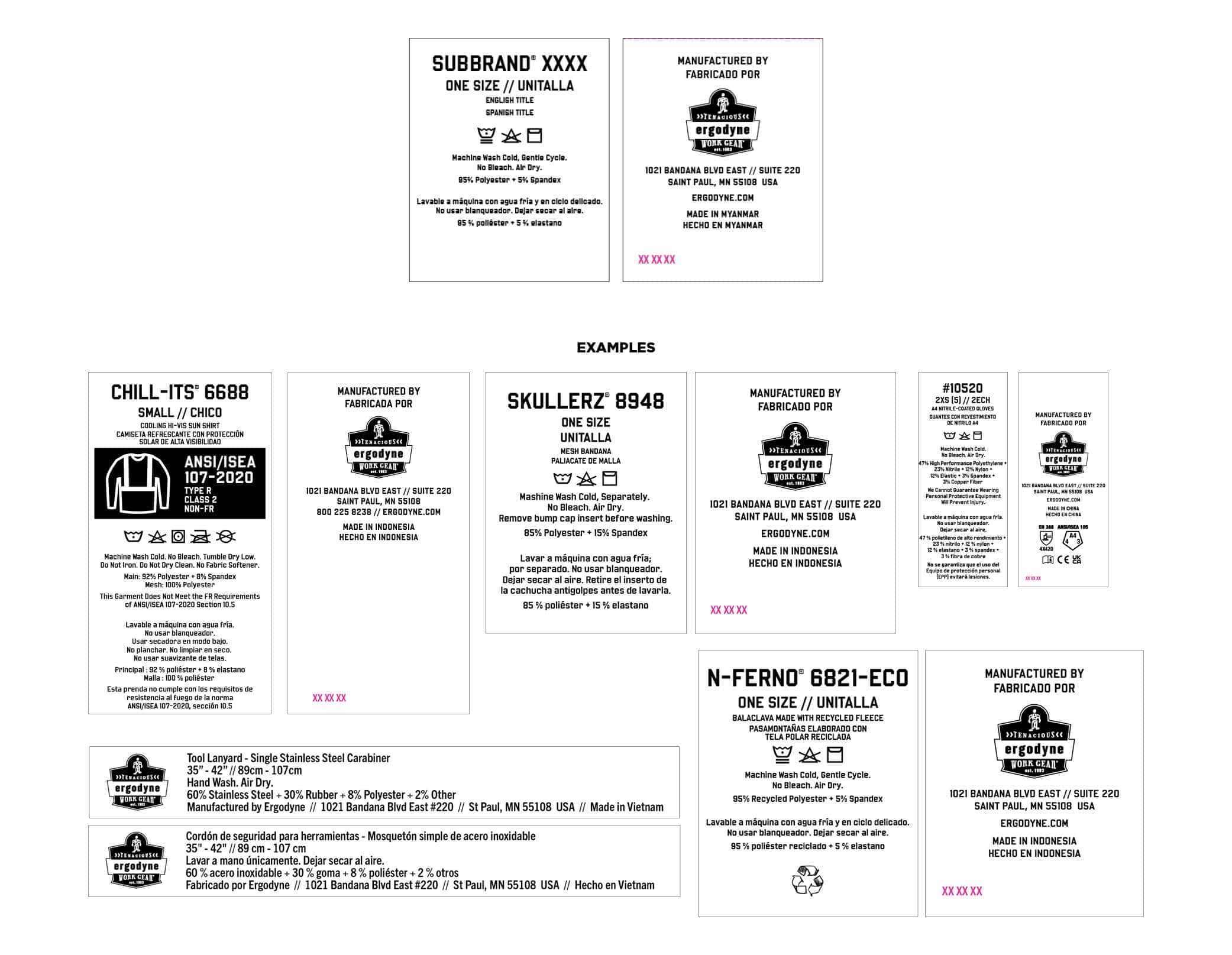
When launching a new product, it can be helpful to reference an existing UPC of a similar product. This maintains relative consistency across the product category.
Content for packaging, UPCs and interior labels is largely derived from the Item Set Up Sheet. As such, accuracy and completion of the Item Set Up Sheet is essential.
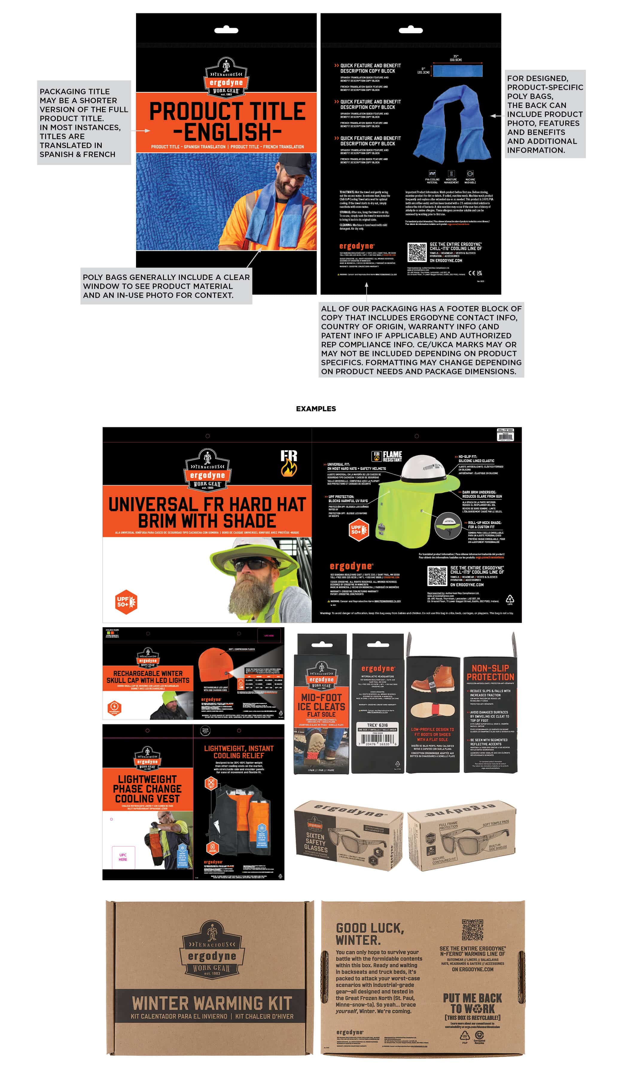
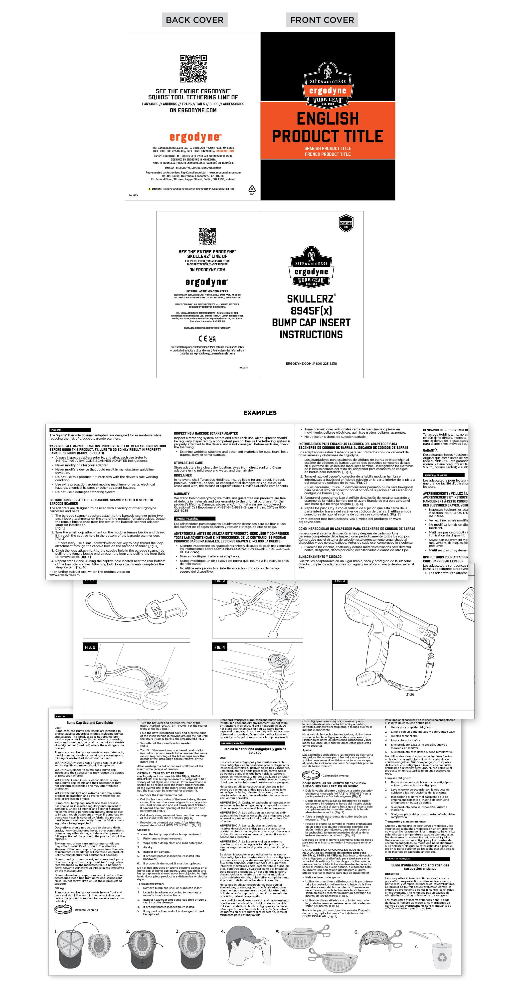
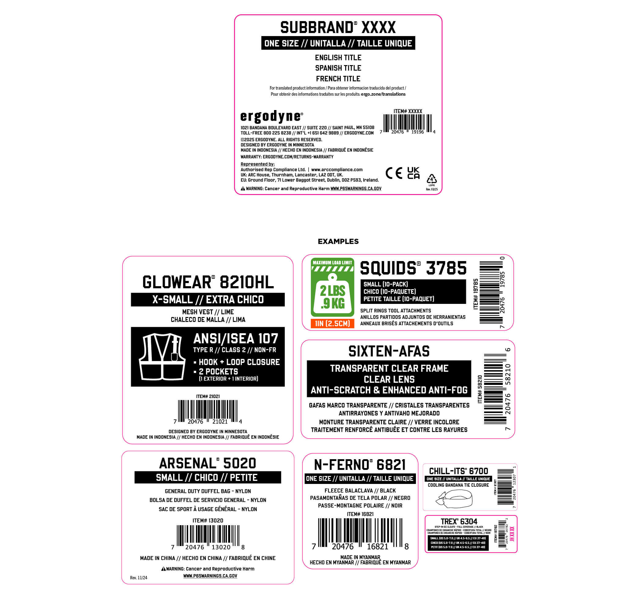
Packaging title may be a shorter version of the full product title. In most instances, titles are translated in Spanish & French
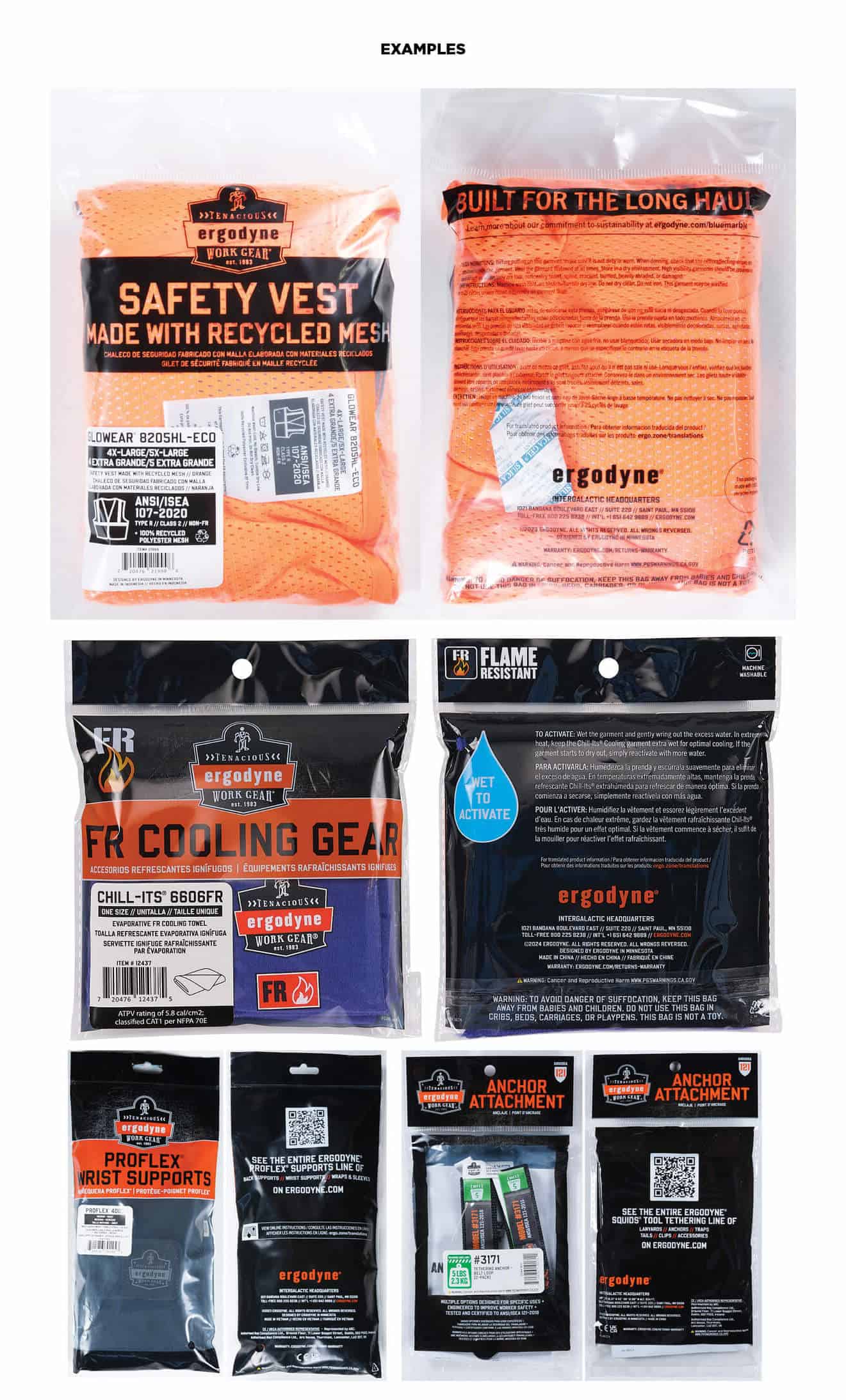
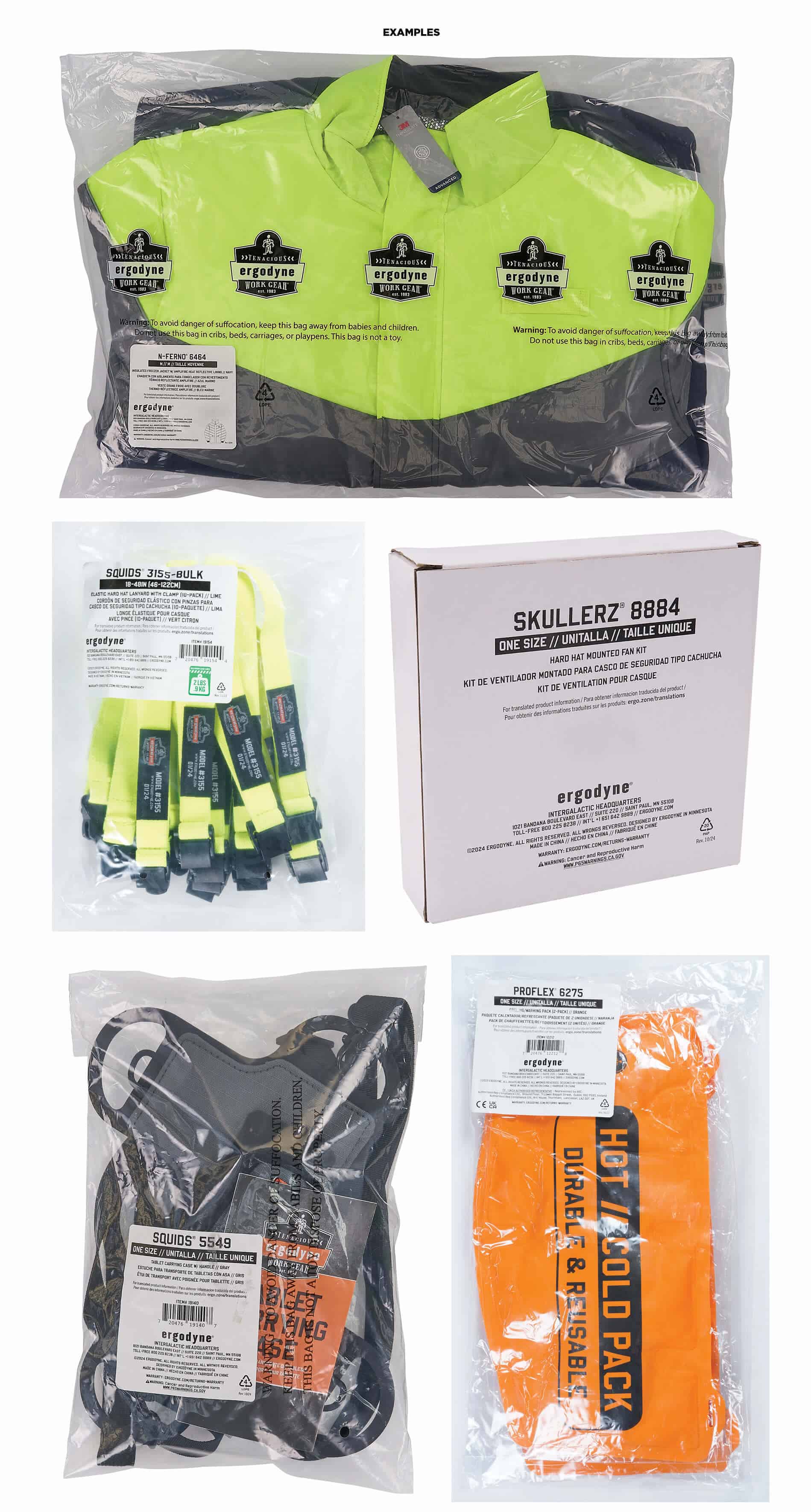
For designed, product-specific packaging, the back can include product photos, features and benefits and additional information.
Poly bags generally include a clear window to see product material/color and and in use photo for context.
All of our packaging has a footer block of copy that includes Ergodyne contact info, country or origin, warranty info (and patent info if applicable) and authorized rep compliance info. CE/UKCA marks may or may not be included depending on product specifics. Formatting may change depending on product needs and packaging dimensions.
Some product comes in “universal” packaging shared across multiple, similar products. In these instances, the product title generally identifies the type of product, and specific product information (title, product number, item number, size and color) is found on the UPC.
Some products are simply packaged in a clear poly bag or blank box. In these instances, all product, contact and regulatory information is present on a larger UPC.
Interior labels generally include sub brand, product number, size, product titles, garment care icons and instructions, material content, Ergodyne logo, address, country of origin and a production code (XX XX XX in magenta, edited by factory during production). Some product categories (gloves, hi-vis, FR, etc.) may include additional regulatory information or test scores. Interior labels include Spanish translations.
Some products include a printed instruction insert. These can be printed in color or black and white and can include illustrations or photography. Instructions are often translated to Spanish and French, as well as additional languages as deemed necessary. All instructions are also posted online in digital form.
Product without designed packaging will come in a clear poly bag with a UPC that includes product title (and translations), product number, item number, size, color and standard footer information.
Poly bags with a 5-inch opening or larger (measured when flat) must have a suffocation warning, either printed on the bag or attached as a label. Failure to apply a suffocation warning may lead to the items being re-bagged.
- Example warning:
Warning: To avoid danger of suffocation, keep this bag away from babies and children. Do not use this bag in cribs, beds, carriages, or playpens. This bag is not a toy.
The warning should be printed or placed in a prominent location and in a legible font size for the size of the bag.
Print size of this warning should conform to the following table:
- Total length plus width of bag Minimum print size
- 60 inches or more 24 point
- 40 to 59 inches 18 point
- 30 to 39 inches 14 point
- less than 29 inches 10 point
The thickness of the bag must be at least 1.5 mil (thousandth of an inch).
- The poly bag must be transparent.
- The poly bag must have a barcode (such as a UPC or EAN) or X00-label that is scannable through the bag or have an X00- or ASIN label on the outside of the bag.
- Poly bags must be completely sealed.
- The poly bag or shrink wrap must not protrude more than 3 inches past the dimensions of the product.
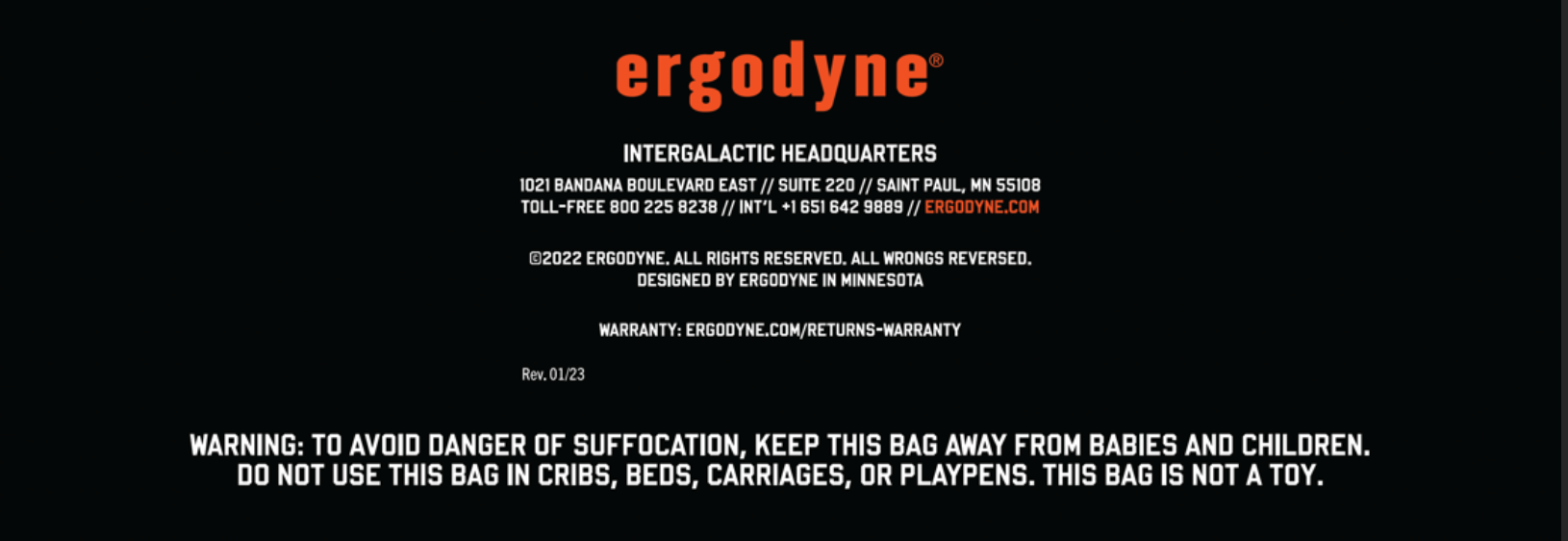
Warning is 6pt (minimum, may not be less than 6pt) Hobokenhigh-Sansserif with URL underlined. The preferred location is the lower left hand bottom corner by the warnings and footer information. Can be flexible location depending on layout.
Note: WARNING triangle is yellow if the file is printed in color. Otherwise, black with white exclamation mark.

There are multiple ways to go about this, we can get by with all three options below until someone calls us out for it.
OPTION A (best option)
- Resin / Paper Codes are directly on the material
- ie. Clear poly bag with paper insert
- Paper code printed directly on insert
- Resin code printed directly on bag
- ie. Clear poly bag with paper insert
OPTION B (2nd best)
- Codes are not directly on the material but context is clarified
- ie. Clear poly bag with paper insert – codes printed directly on insert
- Paper code printed on insert - “paper” written below
- Resin code also printed on insert - “bag” written below
- ie. Clear poly bag with paper insert – codes printed directly on insert
OPTION C (3rd best)
- Codes are not directly on the material and are not clarified
- ie. Clear poly bag with paper insert – codes printed directly on insert
- Paper code printed on insert - no context written below
- Resin code printed on insert - no context written below
- ie. Clear poly bag with paper insert – codes printed directly on insert
- If in a clear poly bag and cannot print directly on bag, printing on the UPC is OK but, we should mirror option B when doing so.
- Refer to the OT Branding Guide for most up to date requirements on mark style and elements.
- Products must be marked directly in order for any other asset or marketing material to mention Oeko-Tex.
- Before marking packaging or other materials confirm product is marked.
Include Year
- Product FABs & Descriptions on website
- Product titles on website, blogs, collateral
Do Not Include Year
- DPO Images
- Packaging
- Exterior
- UPCs
- Interior Labels
- Videos
Warning Locations and Sizing
- Warning Text shall be minimum 6pt font (0.083” height)
- Any deviation to this due to space requirements: Contact Product Compliance Manager
- Symbol Height shall be minimum 4mm (0.157”) height as best practice
- Any deviation to this due to space requirements: Contact Product Compliance Manager
- For general product warnings, warning symbols should be placed together.
- Attention symbol should be included first in any new listing of warnings/symbols to alert the user of the warning.
- For specific warnings, where applicable, place warnings on product near the area where potential danger occurs (e.g., Strong Magnet near Magnet location, Shock warnings near terminals, pinch hazards near pinch points). If not practicable to place warning on product, place warning on packaging following the symbol priority and spacing guidance and any requirements noted in applicable product standards or regulations.
Symbol Priority and Spacing
- Clear distinction between Warning/Regulatory Symbols.
- Priority order: Warning Symbols First
- Priority order: Other regulatory symbols
- See Table for Priority of Warning Symbols.
Priority Order for Warnings
- Warning Symbol
- Wear Eye Protection
- Do Not Use On Or Near Live Electrical Circuits
- Wear Hand Protection
- Read Instructions Before Use
- No Step
- Always Inspect Tool Before Each Use
- Keep Tool Clean, Dry and Free of Surface Contaminants
- Destroy Tool if Insulation is Damaged in Any Way
- Not For Fall Arrest
- Use Safe Work Position
- Strong Magnetic Field
- Risk Of Shock
- Not PPE
- Pinch Point Hazard
- Risk of Drowning
- Fall Arrest (OPE)
- Positioning (OPE)
- Suspension (OPE)
- Retrieval (OPE)
- Ladder Climbing (OPE)
Standards/Compliance Markings: Locations and Sizing
- Some standards have guidance and requirements in the text of the standard.
- Always review the applicable standard first and follow their guidelines.
- If a standard that you require is not in the SharePoint, consult with the Safety/Compliance team for purchase.
Regulatory Requirements for Packaging
- Some laws and regulations have specific requirements for symbols and warnings on packaging based on product type. Specifications are available from the Product Compliance Manager. For example,
- Button cell batteries
- Products containing button cell batteries
- Products compatible with button cell batteries
- Dangerous Goods
- Some laws and regulations have specific requirements for types of packaging, including design requirements and performance requirements. Specifications are available from the Product Compliance Manager.
- Button cell batteries
- Products containing button cell batteries
- Products compatible with button cell batteries
- Dangerous Goods
- Child-Proof Packaging
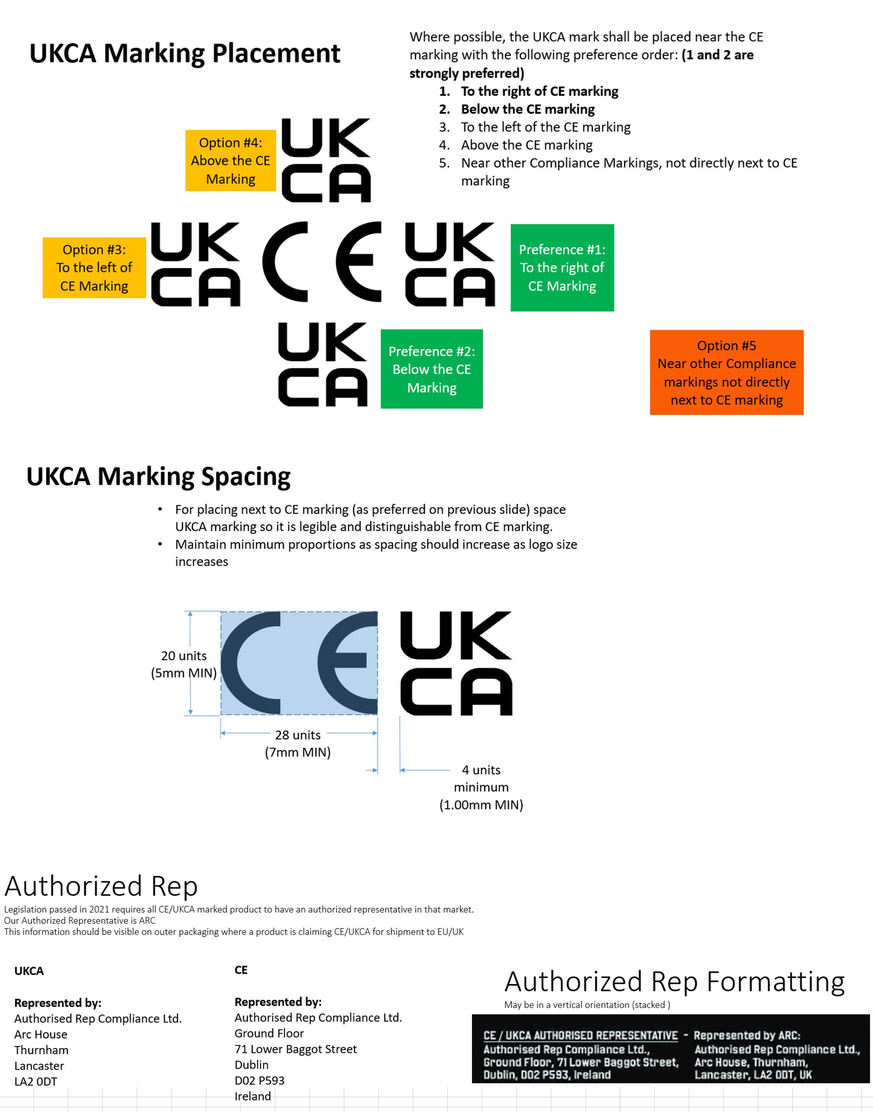
Place Standards/Compliance markings together in a cohesive way
Similar regulatory marks should be near each other. The priority for this is:
- Market Acceptance (CE, UKCA)
- Electronic compliance (FCC, UL, Energy Efficiency)
- Compliance/Accreditations (ANSI, ASTM, NFPA)
- Always translate to French + Spanish.
- If additional translations are needed based on markets being sold and priorities, that will need to be identified by PM Team + Compliance Team and approved by Head of MKTG.
- Main product title is always translated on front.
- If there are FABs, we should make a good faith effort to translate unless spacing makes it difficult to do so.
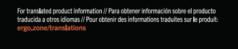
- If there is not enough room on packaging for all translations, include the translations on the web version add a link (ergo.zone/translations)
- PM must alert MKTG if there will be additional copy that may need to be translated and included on a web version and linked on packaging.
The link to additional instructions provided must also have translated verbiage explaining the link.
- Always include the web version link on all instruction inserts, even if all translations fit on the printed version.
- ‘Made In’ must always be translated into Spanish + French.
- We translate the title, size and color on UPCs and Interior labels. Interior label care instructions & content lists are translated as well as the MADE IN only in Spanish.